

When people think about user experience, they usually think about design, usability, and website behavior. However, user experience extends beyond design and how fast a web page loads. An inherent part of your experience on a website is shaped by the words on the page. The words that you use within your navigation, headings, blog categories, and buttons all communicate information to users and directly contribute towards a user’s experience. Beyond that, they’re also vitally important to search engine optimization (SEO).
If you don’t select your words carefully, you’ll create a frustrating user experience that turns potential customers away—and make search engines unhappy.
UX Writing is Directed At Helping Users Complete a Task
To start, how is UX copywriting different from other business or marketing writing? Words are words, right?
While that’s true, we arrange them with different purposes in mind. When writing for the web and in business applications, we typically want the user to take action. UX writing refers to crafting copy that helps users interact with a website, app, or software platform and guide them through tasks.
These tasks could be finding information, buying something, signing up for a subscription, registering for a course, making an appointment, or whatever. It might also be a step towards converting from a user to a lead, such as signing up for a newsletter or downloading your free eBook. Since you’re in business and letting the customer interact with you is how you make money, it stands to reason that helping them complete these tasks is important to you. It’s presumably important to the customer too, or at least we hope it stays important to them.
The more important the purpose of your writing, the clearer it should be.
This is an inalienable, ultimate truth of UX writing. This makes it different from other digital marketing communications. Feel free to be full of whimsy in your Instagram posts or season your blog posts with a flair of personality. You and the user are just getting to know each other then. But when the user wants to take action (any action), you need to put aside the charm and help them through the task. I’ll show you how to do that in this article.
How UX Copywriting Impacts Your Site Rank
Before we dive into the UX writing tips and best practices, you need to know how improving your website’s copy and user experience can impact your overall SEO strategy.
First off, search engines determine your site ranking using factors based on how useful your website is to searchers. If you have a sky-high bounce rate AND low time-on-site metrics, that’s a signal to a search engine that your website is not answering the searcher’s query and that they had a bad user experience.
People bounce from websites when they can’t quickly find the information they need. Your page title, navigation, headings, subheadings, and all of the copy communicates information (at least it should). If your copy is confusing, uses jargon, or is verbose, people will likely decide to bounce back to the search engine results page (SERP) and try the next search result. They’ll continue doing this until they find a website that answers their question. This type of search behavior is called “pogo sticking” and it’s a bad signal to give the search engines.
Search engines are not going to rank your website highly if people are quickly leaving it. The following tips will help you give searchers the information they need.
Page Titles That Rank and Convert
Your webpage title, often called a title tag, is part of your UX, and it’s also an important Google ranking factor.
When people conduct searches, the most prominent thing they see on the search engine results pages (SERP) is the list of title tags. Your title tag is the first impression searchers have of your website and it tells them what your content is about and if they should click to learn more. Not only do title tags tell searchers what your content is about, they tell Google. They’re considered one of the most important on-page ranking factors. Here’s how you optimize them.
Front-load Page Titles with Information-carrying Keywords
If people don’t understand what a web page on the SERP is about, they won’t click on your title.
To help them understand that your website has the answer to their search query, you should front-load your title with the keywords they’re searching for. According to NNG, people typically only see about 2 words in a list of items. When they’re scanning the SERP, those words give searchers a clue or “information scent” about the content. The same concept applies to all titles and headings on a webpage. People don’t read in-depth, they scan webpages looking for clues to their answers.
Be Concise
Another reason why it’s essential to put the most important words at the beginning of your title is that search engines limit the number of characters it displays on the SERP. Aim for titles 50 – to 60 characters in length. If your title is longer, you run the risk of having those characters truncated.
If you start your title with your brand name or excessive adjectives and push the product or service keywords to the end, people will likely skim over your title. In the example below, the brand name “Inner Glow” does not communicate what they’re selling and the informative keywords at the end could be cut off.
BAD: Inner Glow | Savannah and Atlanta, Georgia | Cosmetics and Beauty Bar
GOOD: Cosmetics and Beauty Bar | Atlanta, Georgia | Inner Glow
And while it may be tempting to include just list a bunch of keywords in your title, avoid that temptation. Search engines don’t really like it and it likely won’t make sense to readers.
For the most part, Google will use the text in the title tags as a clue to what your page is about so they can serve it up for the most relevant query. It treats the title tag text as “more meaningful” than the rest of the page. However, they sometimes will display a different title tag. This happens when you stuff your title tag with keywords or your title tag doesn’t match the searcher’s query.
One last recommendation: title tags are also displayed on external websites, like social media platforms. If someone shares your blog article to their Twitter feed, the title tag is usually prominently displayed. Some platforms allow you to modify the titles, but others don’t. So to ensure those viewers know what your content is about, write concise and informative titles.
Write For the Average User:
First and foremost, you must understand your audience and write mainly for them. Depending on the industry and market, you might have a good idea of their background, vocabulary, culture, expertise, and professional jargon. But you don’t want to exclude potential customers, do you? So if your business reach extends to the general John and Jane Q. Public, then write for that broad common denominator.
Take our writing for example: Here at our digital marketing corner of the web, we assume our audience is usually educated and professional and has a grasp of the fundamentals of technology. There is no use in reaching far past that audience since our service is about helping businesses market themselves on the Internet. But we assume that level, and no further. We don’t paste lines of PHP or Javascript code expecting you to know where to copy them into your WordPress engines. We try to break down our jargon and make it as simple as possible, within reason.
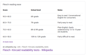
So we’re aiming for about 10th-12th grade reading level on the Flesch-Kincaid scale. For the very general audience, 6th-8th grade reading level is actually the target to aim for! Don’t think this is insulting to the reader; we want to make life easy for them, not make them prove themselves at their peak SAT score.
Take an example from media like popular magazines, your local newspaper, or radio broadcast news. You want short, simple sentences and common vocabulary words.
Of course, all of the above is just a rule of thumb, because some industries (say, the medical field) are married to their native jargon and don’t have much choice. If you’re setting up a landing page for plaintiffs in a medical class action lawsuit, you can probably guess that they’ve added the key terms to their vocabulary.
Give Impatient Users What They Want:
This factor takes a lot less explaining. We’re busy. You’re busy too. He’s busy, she’s busy, we’re all so busy that we’re trying to juggle five things at once. Life in the 2020s is a constant barrage of noise and cacophony. Everything is so hectic.
So this is another reason for clear and concise UX writing: you never know if the user is having a bad day, late for something, or is just sick of searching for the answer to their question. These users don’t want to read dense walls of text, and when they encounter one, they quickly bounce back to the SERP. When bouncing becomes a common occurrence, Google will take note and penalize your website.
On that note, the interactive parts of your UX design need to be clearest of all. Label your links clearly: “click here to download our eBook.” Labels for links and buttons must set an expectation and gratify it faithfully. These labels include the interactive parts of your UX in:
- Text links within copy
- Call to action (CTA) buttons
- Form buttons
- Extensions within Google Ads
How to Break Up Walls of Text:
You can help readers quickly find the information they need by using ample headings and subheadings. Then, readers can quickly scan a page and find the section that’s pertinent to them, instead of having to read the entire page. While it might seem counterintuitive to want them to scan your webpage, it improves the overall user experience and ensures they stick around to read more or explore other parts of your website.
Lists and bullet points can also help readers find and process essential information. Think about your favorite recipe blog. No one wants to read an ingredient list within a dense paragraph. It’s too easy to miss something. Recipes that use bulleted ingredient lists are much easier to follow.
Product or service comparison is an essential part of most buyer’s journeys, and lists help people compare options quickly. If someone is searching your website and they can’t determine if something is included with a service, they might presume that you just don’t offer it. Take a look at the example below. Within the paragraph block, it might be easy to miss that lift tickets are included, but it’s crystal clear within the list.
Version 1:
Take a look at our luxury all-inclusive ski getaway package to see what’s in store for your family on this unforgettable trip. Each trip comes with round-trip airfare, three-night accommodation, two privately catered gourmet meals, lift tickets, and two-hour ski or snowboarding lessons for your family.
Version 2:
Our luxury all-inclusive ski getaway package includes:
- Round-trip airfare
- Three-night accommodation
- Two private gourmet meals
- Lift tickets
- Two-hour ski or snowboard lessons
While we’re talking about lists, make sure your lists use parallel sentence structure. This makes it easier for readers to quickly comprehend information.
Takeaway: Don’t just write for the lowest common denominator user. Write for the user who is boiling over with frustration and just wants to find information or an answer.
UX Copywriting Dos and Don’ts:
Now that we’ve explained some of the motivations driving user behavior, let’s review some best practices that can help you design a better user experience:
- DO explain things in layman’s terms or define jargon terms if you can’t avoid them.
- DON’T obfuscate your message behind jargon that your customers may not know.
- DO avoid acronyms or spell them out if you must use them.
- DON’T bury the reader in acronyms they may not understand.
- DO keep it as short, sweet, and simple as possible.
- DON’T use rambling run-on sentences that sound like a senile wizard telling a pointless story.
- DO use simple English, making your point with everyday terms.
- DON’T use vague metaphors, similes, aphorisms, or “cute” writing which grates on the users’ patience.
- DO make everything crystal clear.
- DON’T be “too clever.”
- DO write easily-scanned text by using headers, lists and bullets, and appropriate use of italics or bold text.
- DON’T confront readers with the dreaded “wall of text.”
- DO make the next step clear with a nice big arrow or a simple button.
- DON’T make the user hunt for the next action.
- DO use appropriate labels for buttons, links, and user interface elements.
- DON’T use picture-based navigation unless it’s intuitive.
- DO break up complex tasks into more simple steps.
- DON’T present the user with one huge chore that’s as complicated as doing their taxes.
- DO account for less able users, such as the handicapped, elderly, or those who aren’t native speakers of your language.
- DON’T assume everybody is a quick-learning twenty-something from your fraternity who will have no trouble keeping up with you.
- DO have reverent respect for the user’s precious time.
- DON’T make the user spend unnecessary time and effort trying to complete your goal.
Case Study: Bespoke Post
Bespoke Post is a company that sells themed subscription boxes. The boxes work like a surprise package once a month, with a selection of delivered items based on the buyer’s interests, but not too specific. Getting to the point, here’s their landing page:
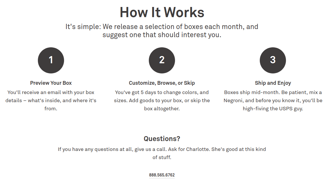
Pros:
- Simple layout, big obvious numbers
- The phone number is easy to find (signing up for the box is a short scroll down)
- We kinda get the idea of how it works, but also glad there’s an FAQ on the site
Cons:
- Got lost on step 2. “5 days to change colors or sizes.” Color and size of what?
- What happens if I don’t change color and size after 5 days? Do I also have 5 days to skip?
- USPS sounds intuitive to most of us as the US post office. Would a person from outside the US be familiar with this acronym?
To be fair, this is a luxury product, aimed at the middle-to-upper-class, with a bit of hip “Generation Z” packaging. So some sassy attitude in the copy is forgivable to go with the brand image. Since they advertise so heavily on Twitter, we figured they wouldn’t mind our polite review.
Conclusion:
UX copywriting is harder than it looks at first. Luckily, it only applies in the part of your website where users directly interact to do business with you. Let your artistic poets compose your blog posts, but hand the UX copywriting over to the trained UX designers and copywriting professionals.