

Hosted By:
Lauren Leone, SVP Healthcare Marketing, Cardinal Digital Marketing
Rich Briddock, VP Performance Marketing, Cardinal Digital Marketing
Watch the Recording
Quotes From the Webinar:
“A good user experience shortens the journey from click to conversion. Remove any unnecessary steps, remove any unnecessary distraction. You want to make that UX as simple as possible for your end-user.”
“You’ve got to follow up on the promises that are made in your ad. Where possible, if you’re going to tout a certain promotion in an ad or a certain value prop, you want to make sure that in the hero, or at least in a dominant position on the page, you are reiterating that promise to the user so that they feel like they’re in the right place.”
“Bringing in slightly less traffic, but converting that traffic at a higher rate should ultimately yield the better result than just traffic alone. Traffic that doesn’t convert does nothing for the business.”
Read The Transcript:
Lauren Leone: Hey, everyone. Good afternoon. Thank you all for joining us. We’re just getting started here. I’m going to do some intros here in a minute as we’ve got all of our registrants just hopping into the room. Excited to share this topic with everyone. It’s a new topic in terms of our webinars series, really moving into some more sophisticated topics here for marketers who have covered the basics and are really looking at where to go next in their marketing campaigns.
My name is Lauren and I’m the SVP of Healthcare Marketing here at Cardinal. I’ve had the pleasure of working with our guest, Rich, today for going on eight years. Learn something new from him every day in every conversation, so I’m really excited for you guys to get to hear directly from him. Rich is the SVP of Performance Marketing here at Cardinal and just in the past two years, has really built and grown our conversion rate optimization program as an agency.
Rich is going to talk us through a number of topics today. Want to start with building a user experience foundation, why is that important, and what are the fundamentals of doing so, and then we can talk a little bit about, should you consider CRO? Is it right for your organization at this stage in your growth cycle and in your marketing cycle, who is CRO really for, and then we’re going to talk about the process itself, and then actually do an audit on a couple of participants?
Thank you so much to Evolution Wellness and to Premier Family Physicians for volunteering to be part of our program today. Woven throughout this presentation, you’re going to see us comment on real user experiences from real healthcare companies, and we really appreciate them being willing to put it out on the table and get some honest feedback from us on the spot.
Then at the very end, we will have a Q&A section, but I don’t want you to wait until the end to throw your questions into the chat. The chat is open. You can get in there and start asking questions whenever you want. Throughout the presentation, I will jump in and ask questions at various points, address those, we’ll put them out to Rich, and let him give you some feedback.
We like to have fun with Q&A, so if you do ask a question and get called out as part of our presentation, our marketing coordinator, Cat, will send out some gift cards and some t-shirts, so please participate. We want you guys to be part of this. Rich, without further ado, let’s start with the first steps to user experience before CRO is even a consideration.
Rich Briddock: Absolutely, and Lauren, thank you for the intro. Thanks to everybody for joining us here for 60 minutes and taking time out of their busy days. I know we’ve got some familiar faces and some new faces as well. Hopefully, you guys find this useful and interesting, and it will spark some ideas to take into your own UX and CRO optimizations for your companies.
I think user experience is a term that gets bandied around a lot and it’s very, all-encompassing term. Really, it’s about how a user feels when they’re experiencing with your product or your service. In this case, when we’re talking about products or service, we’re really talking about your website or your landing pages. Really what CRO is, is CRO is the testing component of user experience.
It’s a mechanism to perfect your user experience and increase your conversion rate, but there’s not really a massive value in starting to do a lot of testing when your user experience is flawed. Essentially, testing your original user experience against a slightly modified variant of your user experience, if that user experience isn’t at least getting the basics right. What you want to start when you’re thinking about going into CRO is you want to start by looking at your existing user experience, and making sure that you’re at least adhering to best practices.
A way to try and understand if you are providing your user with what they need is by a simple way, is to look at this model here which is called the Fogg Behavior Model. Essentially what the Fogg Behavior Model illustrates is that a user that is highly motivated and is given something that they have the ability to do, something that is relatively easy for them, will take the desired action that you want to take. If you are unable to motivate them, and if you ask them to do something hard, and you’re asking them in that moment, you’re going to fail in getting them to take the action that you want.
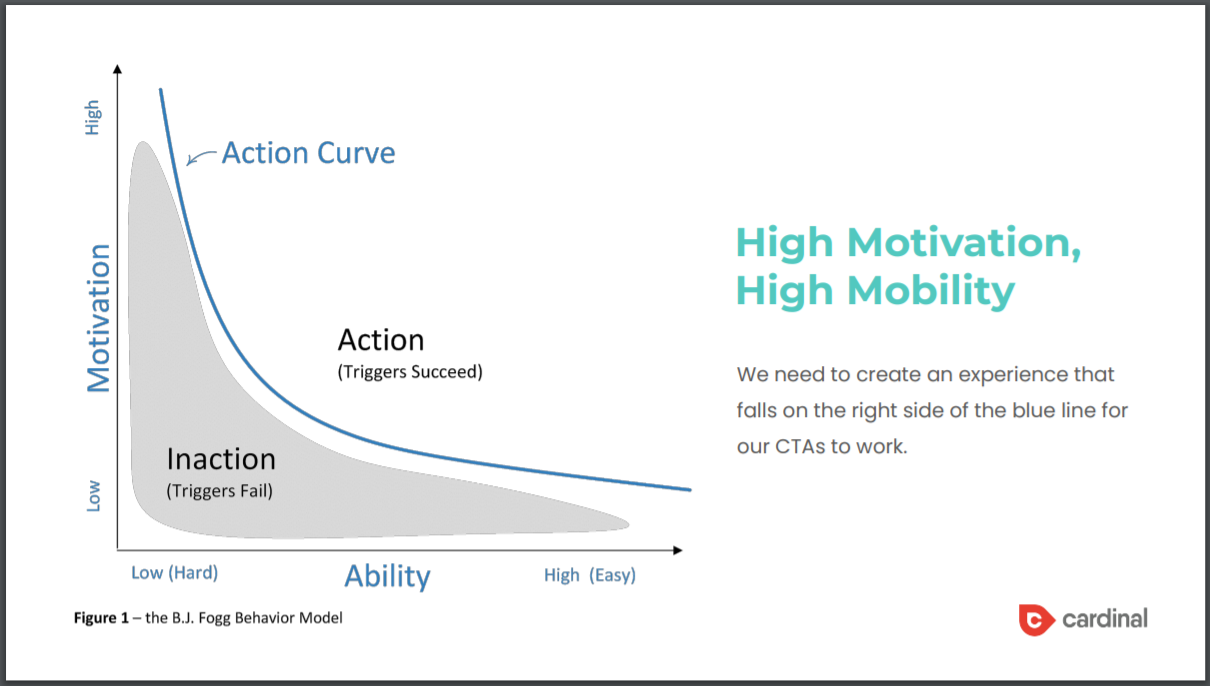
It’s pretty self-explanatory, but people who are very motivated and think to do things that are very easy, will do those things more often than not. That’s what you’ve got to look through the lens of, to make sure that your user experience is delivering against those two things
Lauren: Rich, when you think about user experience, talk about what those could be. Is it your homepage on desktop? Is it landing pages? Is it mobile? Is it everything? Just define that for everybody.
Rich: It’s everything. An example of high motivation in terms of a user experience would be understanding what your users care about the most, and then making sure that you’re hitting on what motivates them. If you sell a healthcare product and what users really care about is the outcome and the life that it’s going to help them lead, make sure that you’re leading with the outcome because that is what’s going to motivate them. Don’t give them a bunch of technical jargon about the product, or how much it costs, if that’s not what really is driving them to make that decision. Ultimately, they’re just trying to understand how that’s going to improve their standard of living.
From an ability point of view, make your site easy to use. Make sure that it’s functional, that information is easy to access, that the CTA’s are clear and that they follow you through the page so that you don’t have to scroll 20 scrolls on your mobile device to try and find that Call button to actually call someone. There’s a lot of different things that go into user experience, both from design, functionality, content on the page, how it renders on various devices. It really encompasses all of that.
Lauren: Awesome. Thank you.
Rich: In terms of creating a simple UX, something that’s easy for users to essentially have a high ability and to be highly motivated, you’ve got to go back to how people think. People have two distinct modes of thinking. There’s the fast and intuitive mode which is sometimes known as thin-slicing, and that’s a human’s preferred state. When you think about first impressions, when you meet someone, you get that initial gut reaction, you make a quick judgment. That’s how humans like to think, especially in today’s age where you’re being bombarded with so many signals and so many things, I want to be able to swipe right and see, do I like that thing? Yes, I do. Excellent. I made my decision.
The other mode of thinking is slow and analytical. This is where you’re really forcing a user to think, and have to disseminate information in order to understand whether they’re making the right decision, and users don’t like that. If you’re making the user work to understand if your product or service is what they need, that’s an immediate turnoff. Something that you want to think about with your user experience is if I know that my user needs to understand three things to take the desired action that I want them to take, I need to present that information to them as quickly, and as easily as possible.
Lauren: Rich, I have a question that came from John in the chat, and it’s the perfect segue. I know you’re going to talk about this in more detail when we get to the audits, but you talk about when we understand what the client wants, then we present those things in a certain way, how do you know what the client wants? Do you have any tips on even just understanding that as a foundational item?
Rich: Yes, absolutely. We will get to it, but especially in CRO, and also in user experience, research is the most critical component of the process. A lot of people think it’s having a pretty design or it’s the number of tests that you run or the number of tests that you deploy, and those things are important, but it’s about the research that you do on your users, and that shift to user-centric marketing. Understanding your user can be done in a number of different ways.
We utilize surveys of both existing customers, past customers, but also we’ll run survey tools just out to the market. For instance, Pollfish and Google surveys. If you’re a client like a dentist, where you have a wide audience base and where most people could fit into your audience, those are valuable tools to set up surveys, and really ask your users what they care about most. I think we have a slide in this deck from Pollfish that shows an example of that.
Then you can do user testing. If you have time, it’s a great thing to do is to actually bring in some of your existing users and show them the website, show them the mobile site, the mobile app if you’re developing an app. There’s also professional sites and services where you can hire professional user testers to also essentially vet your experience and make sure that the things that you want to convey are being conveyed effectively to your audience.
Lauren: Rich, something like that can be done by an agency like Cardinal, for example. You could also, if you have a much larger scale research need, you could use a true research company. There’s a lot of ways you can do it. Some of the tools that you mentioned are quite user-friendly, if you have a marketing department large enough with some capacity, you could even run it yourself. There’s no right or wrong way to do it.
Rich: Yes, absolutely, and it’s relatively cheap to do. Obviously, if you’ve got a wide enough group of your own customer base, you can use a tool like SurveyMonkey to survey them for free, but if you want to use something like Pollfish and Google surveys to go outside of your existing user base, you’re probably looking at around $2 to $3 for a respondent. Most surveys need 400 respondents to be considered statistically significant. You’re looking at an investment there of around $1,000 to $1,200.
Lauren: Awesome. Thank you. Cat, I know you’re listening in. If you don’t mind sending John a little gift for participating, that would be great. All right, Rich, let’s move on to the next.
Rich: Yes. I want to provide an example of what poor user experience is. This example in particular is actually borrowed from CXL, which is an institute that specializes in conversion rate optimization, but it’s a great illustration of poor UX, so I thought I’d share it here with you guys today. Here’s an ad, you’re browsing around the internet, and you see an ad and it talks about marketing automation and mobile marketing automation.
As marketers, we’re always looking at automation and we know that mobile is the future, so it’s like, “Okay, great. I’m interested in this, I want to understand how this marketing automation platform is going to solve my issue.” I click on the ad and I want to see a live demo. It’s pretty clear what that CTA is. Then I go to this experience. Oh– [crosstalk]
Lauren: Sorry, Rich.
Rich: Click on my slide master here.
Lauren: My arrow didn’t work. I have to use the next button, user experience within this platform.
Rich: Yes. Like I said, I’m really interested in seeing more my live demo of this mobile marketing automation platform. I click the ad and then I get through to the landing page. All of a sudden, I’m just overwhelmed. Lauren, if you click on the next slide, there are 107 different options for me to take on this page. The worst part about it is you can see here that there is something that says, “See a live demo,” but it’s not anything that’s driven with visual hierarchy.
There’s a picture of a laptop underneath it, it’s just in plain text with an arrow next to it. There’s these green boxes underneath that are actually drawing my eye much more, but none of these three are the options that I saw in the ad. Then there’s the Chat With Us section here to the right that’s very distracting. As a user at this point, I’m incredibly overwhelmed and my ability to make the right decision is significantly low because I’m having to hunt around, I don’t understand why there are all these other options. There’s nothing on the page that’s actually talking about the product because it’s just a ton of links out to other things for me to go to.
At this point, I’m completely lost and there’s nothing that was in the ad that actually appealed to me that is reiterated on the page. You guys might think, “This is one of those crazy examples that’s just been pulled up to demonstrate an extreme example in a webinar,” but it’s easier said than done, especially with homepages, to have a level of clutter that’s really going to impact the ability of the user to take the desired action that you want to take.
Lauren, I think if you go to the next slide here, this is actually an example from one of the companies that submitted to us for a UX audit. You can see here that the red dots on this homepage are links that the user could take to various other pages on the site. There’s been a lot of studies done, psychological studies done, about what is the optimal number of choices for a user. We tend to go too narrow where we think, as marketers, we can only give a user one choice because if we want the users to do the one thing that we want them to do, the easiest way to do that is to just give them that choice.
Actually, studies have found that that’s not accurate. Users want to have at least some choice, but that the optimal number is between five options and seven options. That’s the optimal number of choices that you can give a user. Here, when you look at this page, you can see that there is a lot more than seven options and with every option that is added, the user becomes more confused and is unable to make that decision to the pathway that they want to take.
These are the things that when we’re thinking about user experience, we need to be looking at and say, “Okay, if we’re driving traffic to this page, we need to make sure that this page is specific to what we were driving the traffic there from.” If I’m looking for a PCP appointment, then the page should be simplified to focus on booking an appointment with a primary care physician. The visual hierarchy here should be a lot stronger around the Book an Appointment button. It should have a contrast color, it should stand out against the blue.
We should be pushing some of these other links much further down the page so that I may be interested in engaging with them, but the hierarchy of the page has them further down so they’re not distracting me if I truly am just looking to book an appointment.
It’s little things like this that we can do that you may be falling into these traps without even realizing it and it’s pretty simple structural work that can be done to help simplify these pages, and make them more effective, and make it easier for you to use it to take those actions that you really want them to take.
Lauren: Rich, for the people sitting on this call that think, “I offer 10 services or have all these locations, how can I possibly narrow it down? They’re all equally important.” The homepage represents a catch-all for what your business has to offer. Your recommendation would then be what? To focus on optimizing service-specific pages where other entry points into the site besides just the homepage?
Rich: Yes, absolutely, I think, and also to test, we do a lot of homepage testing on CRO. Typically, you’ll have some idea of what is most important to your business, what is most important to the bottom line. For instance, if you’re a health system, maybe your two main entry points are PCP and ortho. You want to focus in on those two service lines. You have a hierarchy that, while you talk about other pieces, your hierarchy leans into those two service lines because the majority of your users are going to come to the homepage and want to take action against those two service lines.
You can still provide the pertinent information to all your other users and still be an effective catch-all, but it’s just making sure that your informational hierarchy and your visual hierarchy are set up in such a way where you’re leaning into the things that are most important to drive the bottom line of your business.
Lauren: Perfect. We had a question and I think this is going to address it. Let me call out Sandy’s question in the chat real quick, which is, is there an easy way to even understand the starting point for user experience? How do you create that benchmark? I know you’re going to talk about some best practices here, which I think becomes the starting point and then we’ll talk about measurement, but anything you have to add to that, Rich?
Rich: Yes. In terms of evaluating your own user experience, there’s a number of different things that you can do. There’s quantitative analytics. You can take a look in Google, as long as you guys have got Google Analytics set up, you can take a look in Google Analytics and understand how well your site’s performing, how effective it is at driving visitors and turning them into conversions, how much time people are spending on certain pages, what they’re doing on those pages, what the bounce rate is, all of these metrics will give you a quantitative overview of how effective the site is.
From there, something else that you’re going to want to do is a heuristic walkthrough. A heuristic walkthrough is essentially what we’re going to do on here with Evolution Wellness at the end of this presentation, but it’s where you’re looking to see if we’re adhering to user experience best practices. There’s a certain set of rules. This might not be something that you can do yourself if you’re not that au fait with user experience. You may have to bring in someone, a consultant, an agency, to do this heuristic walkthrough with you, but that’s another qualitative mechanism in order to understand how effective your UX is.
Then there’s things like mouse analytics, like mouse flow, Hotjar where you’re essentially looking at heat maps. You’re looking at user recordings, and you can even deploy polls and surveys through those tools, to understand if your user is finding the information that they need. You can have through that, through those tools, you can have a very simple poll on the bottom that they can click and it opens like a live chat and you can ask them a simple question. Did you find what you were looking for on this page? Was this page effective at helping you get what you needed?
Although not that many people will engage with that, over time, you’ll start to get some semblance of answers from your users about whether or not that was effective. There’s other tools as well where you can test your user experience through. There’s a platform called usability hub, where you can run different tests to essentially evaluate your user experience. There’s a lot of different things out there. I think you would probably want to speak to a UX expert or at least a consultant or a contractor, if not an agency, to try and help get set on the right path.
Lauren: Perfect. I know you have some examples here of a good place to start, so that’s, like you said, just some things that they can start to think about if they’re wondering if their UX is a good starting point.
Rich: Yes. That’s right. We can touch on these. Ultimately from an– again, we talk about ability. A good user experience shortens the journey from click to conversion. Remove any unnecessary steps, remove any unnecessary distraction. You want to make that UX as simple as possible for your end-user. Again, whether that’s having a button that stands out, whether it’s having a sticky CTA that sticks to the bottom of the screen on mobile, whether it makes sure that you’ve got the most pertinent information up top and you’re super succinct, and it’s scannable, all of those things are going to help your user get to that conversion faster.
Another one that’s really important, which I think is a mistake that you see a lot, especially if you’re driving traffic to like a home page, as we showed in that prior example, is you’ve got to follow up on the promises that are made in your ad. What we see with a lot of customers right now, is they’re doing endless tinkering on the ads. They’re pre-click optimization. They’re trying hundreds of different ads in market, different promotions, different value props, different motivational statements, and then they’re driving all that traffic to exactly the same experience.
If you’re doing that, it’s impossible to follow up on the promises that you’re making the ad because you may have 50 or 100 different promises out there, and the same experience for all those folks. Where possible, if you’re going to tout a certain promotion in an ad or a certain value prop, you want to make sure that in the hero, or at least in a dominant position on the page, you are reiterating that promise to the user so that they feel like they’re in the right place.
Again, super important to understand the user and what are they motivated by? What is the friction and the hurdles that are going to prevent them from taking action? If you’re advertising a certain procedure, but there is a perception by your user that that procedure is dangerous, one of the things that you are going to want to do, is you’re going to want to combat that straight away on your page, in your experience to remove that barrier and ideally try and provide some empirical evidence that shows that it is not dangerous. Have some testimonials of prior patients that have been through the procedure and have had a seamless experience, anything that you can do to essentially eliminate those barriers and those hurdles.
It’s super important to understand the user, what motivates them, what holds them back, and what they’re looking to try and do. Then ultimately, what the user is looking for when they click through to a website or a landing page is clarity. Don’t be ambiguous in any of your statements, make sure that you are being very, very clear about what it is you have to offer, make sure that your imagery is clear and that it resonates with what you do.
Things that often get missed, like expectation managers, so when someone fills in a form, tell them, above that form, exactly who they’re going to end up speaking to, when you’re going to contact them. If it’s a callback, a triage nurse will be in touch with you within four hours, so they know exactly who’s going to call them and when that they’re going to be called. That’s really important to use it when they’re giving up their personal information.
Then I think this goes back into that top point, but create a really clear path to the conversion goal. Make it very easy to drive them to that action that you want them to take, and don’t convolute it, and don’t push them into too much information. Don’t force them to go find what you want them to do.
Lauren: Awesome. We had a question while you were talking, actually, at the very beginning of this slide, Rich, what are the biggest issues people make in their digital experience? I think in going through these best practices, you just spoke about what not to do as well. Amanda, hopefully, your question got asked in that last segment, and if you feel like it didn’t, feel free to chime back in and we can clarify on that further.
Rich: Yes, absolutely. Happy to provide clarity there. I do want to talk about design though because it is important and we talk about the user and the user’s motivation, and ability, and simplicity, but there’s also visual credibility. Design is really important. Now, visual brains process information 50 times faster. It’s not only important to have a pretty website, but one that has a good visual hierarchy, where a user can quickly disseminate, even just by looking at the picture, what this website is about.
We tend to see websites that you use pretty ambiguous stock footage that could be about anything, lifestyle imagery that could be about anything. You’re doing yourself a disservice by doing that because ultimately, a user is trying to understand what the website is about by the images that they see on that site before they’ve even read the copy. You should use images to provide that clarity.
Then one thing I will just say on design as well real quick, is there’s been studies that prove that essentially, even though it shouldn’t matter, a good-looking website, users are much more likely to engage with a company that has a good-looking, professionally designed website, than a poorly designed website. It’s really important to think about that when you’re considering your user experience, does the website look good? Does it look modern? Does it look up-to-date? Is it clean, et cetera, because that’s going to play into the back of your user’s mind.
Another thing just to talk about with user experience that’s important, is there’s a lot of neuroscience that underpins user experience and an effective user experience. Essentially, what you want to do is you want to encourage dopamine, which is people’s reward mechanisms. Think about surprise and delight. That goes back to that statement about reinforcing your promises that you’re making in your ad. You really want to surprise them, because if you do so that’ll release dopamine and dopamine motivates them to take action.
Conversely, what you need to avoid is triggering cortisol. That is your stress hormone. If I go to a website and it says, “Sign up for a free trial,” and then when I go to sign up for the free trial, I have to put my credit card information in, that triggers cortisol because I’m like, “Hang on a minute. I thought I was getting a free trial here. Now you’re asking for my credit card information. I’m not ready to give you my credit card information yet. I’m just looking at this product. I just want to see what it does,” so that will prevent cortisol.
Again, similar to listing a price in your ad and then not showing pricing on your website, those things will produce cortisol, and that’s going to make me stressed. Then that prevents me from taking action because I’m in a state of stress and I’m going to leave the site.
Recapping on that in terms of UX best practices, some UX best practices here, social proof early and often. I think particularly in the medical field, talk about your patient’s experiences, talk about how your customers have found working with you. Social proof and testimonials are also a great place to understand your user. I cannot express that enough. Go through and read your users’ testimonials about you. Go to Google, read their testimonials, Trustpilot, any solution that you use like that, and mine that data to understand why they loved working with you, or why they didn’t, and then that will help inform your user experience, what information you need to convey to future prospects, to get them to take the action that you wanted, to reassure them and help them overcome the hurdles.
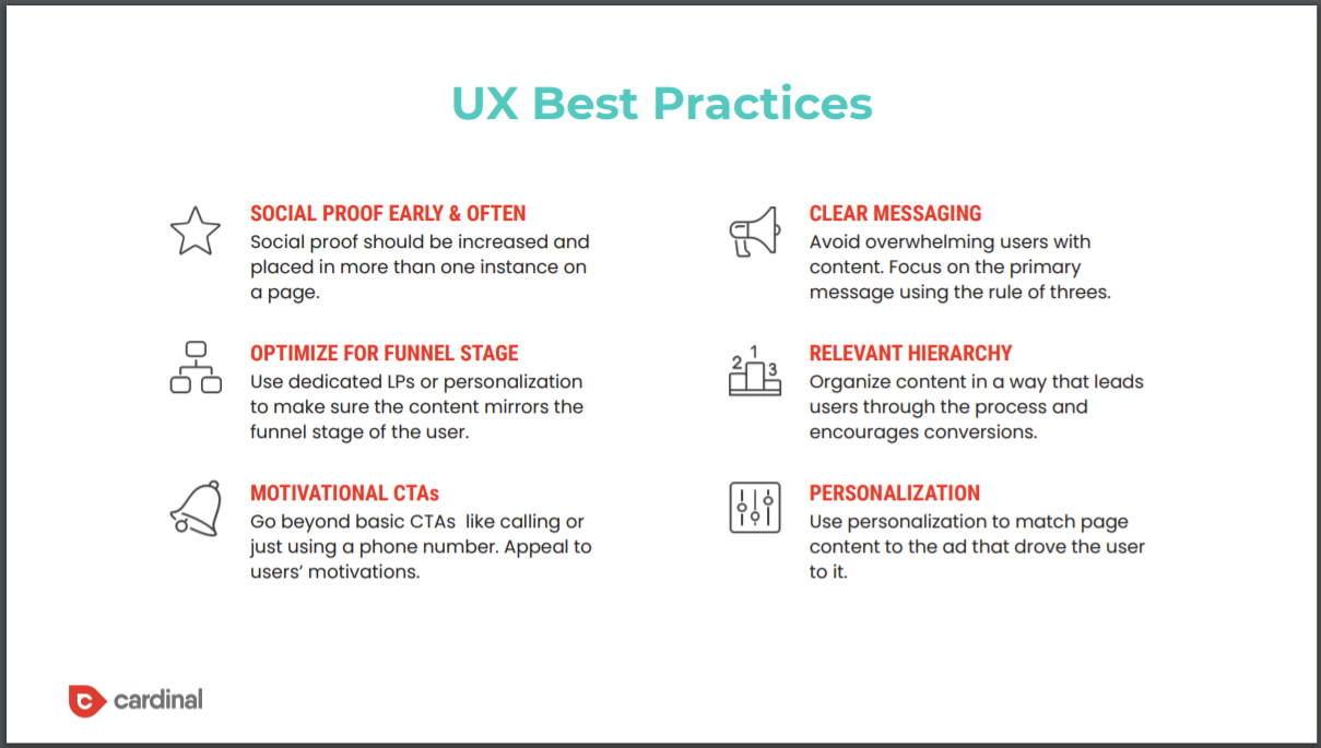
Another thing that we’ve really started doing over the last year, and this goes back to that comment about how the same experience for everyone is flawed, is some of you guys may have company services that are high consideration. Your users will be doing a lot of research, and they will go through different phases of the funnel, of the patient journey, and they shouldn’t get the same experience regardless of where they’re at. They should get an experience that is much more tailored for them.
If I am in the exploratory phase, I should be getting a top of the funnel experience where I’m seeing informational content, maybe I get to download an ebook guide. It’s a very soft conversion action that I’m being asked to take, versus when I’m at the bottom of the funnel, I should be seeing a very short page that is very action-oriented, very transactional, what can I do to get you in the car today, creating a sense of urgency, because I already understand the service, I already understand why you’re the best option and how you differentiate from your competitive set, so now I just need that extra nudge to take me over the line.
I would encourage the folks on this call, if you have a high consideration purchase that happens over weeks or months, to consider breaking up your experiences by funnel stage. Another very simple one is these motivational CTAs. You see it all the time with the phone number button where it’s just got the number written on, and you’ve got the phone number icon. It’s the basic example and it’s like– your user’s smart. They know if there’s a button with a phone icon on it that it’s a Call button.
Use that text instead of displaying the number to motivate them to click on it. Tell them who they’re going to be speaking to, tell them why they would call you in that button text. There’s just tiny little changes like that that can really improve your UX. I’m not going to go through all of these because I know we’re short on time, but I hope that was helpful on user experience.
Lauren: Yes. Rich, this is going to go out to all the registrant’s so they’ll get a chance to read this in more detail. Let’s touch on the fundamentals quickly. I want to make sure, we’ve got about 10 minutes before I want to get into the live audit so we’ll touch on some of this. We had a question which you may address at some point in this, Rich, so if you do, let me know. Craig asked a question, and I’m going to tweak Craig’s question a little bit. He asked, can you talk about what you need to make sure you have for SEO?
Let me convert that a little bit for this conversation and say, how do you balance CRO with SEO? SEO is traditionally known for longer-form content, internal linking, just different fundamentals than perhaps conversion. They seem to be these two conflicting ideas. What tips, if any, do you have for how to get the best of both worlds?
Rich: I would say, first and foremost, if you are running paid media, that you have a separate set of landing pages, or if you’re a multi-local business, location pages that are non-indexed, where you can run any kind of CRO test, UX best practices on them to your heart’s content without having to worry about any negative SEO impacts. That would be the first thing that I would do if I was running media.
In terms of your actual pages where you’re running CRO, but you have an SEO component that you have to be mindful of, it’s important that you engage with whoever is essentially running your SEO. If it’s an agency or if it’s an internal resource, it’s important that your UX and CRO folks are in cahoots essentially, and that they’re running all of their tests by your SEO folks, to make sure that there’ll be no negative impact on SEO, so that any of those concept factors, very descriptive H1s and things like that, and not being negatively impacted by CRO tests that are being ran.
I will say though that there’s also some balance that you have to strike. We ran a couple of CRO tests for Lifestance, which is a behavioral health client of ours, which did have a slight impact on their SEO rankings because we were essentially doing some redirects which had somewhat of a negative impact on their rankings, but their conversion rate increased to such an extent that it outweighed the traffic that was lost by essentially personalizing the experience and introducing these redirects.
Now, we saw that it had a negative SEO impact, and then we went back and we readjusted the way that we were creating those experiences so that it wouldn’t, but sometimes it is actually, you just have to weigh up what’s going to deliver the biggest yield. Is it going to be a better user experience or is it going to be slightly higher rankings? I would say if there’s a concern, work with your SEO team to make sure that you guys are aligned on what tests you can execute.
Lauren: Bringing in slightly less traffic, but converting that traffic at a higher rate should ultimately yield the better result than just traffic alone, traffic that doesn’t convert does nothing for the business.
Rich: 100%. I think we lost 5% of our organic traffic on that test, but we increased our conversion rate across the board on all traffic by 30%. It was a massive increase in conversions.
Lauren: Awesome. I like to hear that. Fundamentals of CRO, about five minutes to talk through this and then we’ll jump into the audit.
Rich: You’ve got your good UX now, you’ve gone through, you’ve got everything where you want it to be, and now you’re ready for CRO. What CRO is, it’s systematic improvement at conversion rates on key pages in order to increase conversion volume, or lower your CPA, and actually can also help increase your lead to sale ratio by improving the quality of your leads. It’s really the testing component, and we’ll get into this, but think about AB testing, multivariate testing, personalization, that’s what CRO is.
Really, why you should diversify into CRO is, the performance improvements available through CRO can substantially outweigh the pre-click optimizations that you can make. I think we just talked about it there with that SEO example of, you could work for three years to try and gain the amount of organic traffic that it would have taken to drive those conversions without CRO, that we were able to do in one test on the CRO side. The yield can be huge, and especially from a cost benefit perspective, companies don’t tend to spend a huge amount of their budget on CRO.
Usually around 5% of their marketing budget goes to CRO, but a sustained CRO offering, just like SEO, is such good value for money. It can increase your conversion rates from 200% to 500% over many years. The yield is huge.
Lauren: Rich, I see you mention here, specifically important for mature campaigns, whether that’s search, organic, whatever it is that you’re doing. When you feel like you’re tinkering for an incremental cent here or there on your cost per clicks, or you’re trying to get a keyword from position three to two, something like this could be a much better use of your time and energy than that small tinker that you’re trying to do in a specific campaign.
Rich: Absolutely. Especially if you’re spending significant amounts on media, you’re probably going to find that your most expensive media, your most inefficient media has a very high CPA, and you can take that money out and spend it on CRO, and almost lose nothing in terms of lead volume by redirecting those funds.
Is this just a fancy way of saying landing pages? Absolutely not. CRO, as I mentioned before, you can do it on the home page, you can do product pages, you can also obviously do testing on landing pages, but it’s really about the systematic testing of user experience on any page that receives traffic, in order to determine what the optimal user experience should be in order to drive a specific conversion action. I mentioned this already, but essentially any page that has decent traffic volume can be tested. The core ones are going to be things like location pages, landing pages, home page obviously, but then your core service pages also, and even blog pages.
I’ve touched on this already, but another thing that CRO can be utilized for and it sits outside of the testing function somewhat, is personalization. Obviously, creating one-to-one experiences and personalization has been a buzzword right now in marketing for a while now, but we spend so much time letting algorithms try and create the perfect ad for us in the pre-clinic environment, doing all this ad testing, but then you get the same generic experience.
Utilizing personalization to create one-to-one messaging by serving the same image that the user saw on an ad, or the same hero headline that the user clicked through on an ad, or even inserting the same keyword that a user saw in an ad or the user searched, really helps to increase conversion rates. It’s something that can be deployed relatively seamlessly nowadays without having to create thousands of different page variants. You can have one page, and then you have programmatic personalization that runs on top of that that creates these unique experiences that are more relevant for your end-user. It’s definitely a worthwhile thing doing because if you’re spending all this effort over here, and then just sending them to that generic experience, you’re not really going to reap the benefit of all the pre-click work that you’re doing.
Lauren: Rich, one of the best examples of this that we’ve seen is multi-location practices. Tens, hundreds of practices, and rather than sending to something like a generic location finder and putting the burden on the patient to then figure out where they need to go, it’s really understanding where they are geographically and serving them the most relevant location within your practice.
Rich: Yes, absolutely. That’s a great [crosstalk].
Lauren: That’s a big one. Touch on who CRO is for before we dive into this audit.
Rich: Sure. CRO can really be for anyone, especially if you’re considering doing it yourself. Google Optimize is a fantastic free testing tool that you can deploy, and as long as you’ve got patients– You could have low volume to your site, low-volume traffic to your site, and you could still do some testing. You’ve just got to be patient, getting to statistical significance will take a while. People who should consider a sort of CRO retainer with an agency, it’s folks who have more than 10,000 sessions a month to landing pages or to web pages that can be optimized for conversions. Especially, if they have low conversion rates or lower than average conversion rates for their industry, and an objectively poor user experience.
Maybe you’ve done a lot of work in SEO, you’re getting a lot of traffic. Maybe you’ve spent a lot of money in media, and you’re driving a lot of traffic, but you’re just not converting it at a decent rate. I think average conversion rates across all industries is something in the region of 2.5%, so maybe if you’ve got a conversion rate of 1% and your industry is 4%, then you know you have a conversion problem. At that point, you should be looking for conversion rate optimization as a solution.
I think another benchmark that we throw out there when we’re vetting our prospects and clients on CRO is, if you’re spending $75,000 a month or more on media, generally at that rate, unless you have a massive amount of search demand, and unless everything is absolutely brilliantly optimized, you’re going to start to see some wastage there. You’re going to start to see some ad spend that really isn’t yielding a ton. It could be some expensive non-brand terms, it could be some social traffic that’s not really– Some social audiences that aren’t performing that well. Usually, there’s a little bit of wiggle room to take that money and reinvest it into CRO and see better performance across the account.
This kind of segues into [unintelligible 00:43:06] high spending programs are fertile ground. Like I said, they usually have some non-converting spend. I’m sure if you were spending $200,000 in Google Ads, you could probably look in there and find $6,000 to $7,000 or $8,000 a month that drove zero conversions. That’s not to say there’s no value to that traffic, but you could probably take it and use it for CRO and yield more results. You also tend to be more sophisticated and have more [unintelligible 00:43:33]. You also tend to have landing pages, so there’s more flexibility and fluidity there from a CRO point of view.
Lauren: I think you got this one, yes. Thanks for helping us get this one out there. This one’s covered. I’ll let you touch on this one, Rich. Sarah asked, should CRO be run in tandem with the website design? Like when you think about CRO, does it mean you’re heading towards a website design? Do you need to redesign your website first and then do CRO? What’s the appropriate order of operations?
Rich: There’s not an easy answer to that. It’s going to depend on essentially how good your user experience is now, and whether or not that’s worth testing. It’s also going to depend on whether or not you want to use CRO testing to inform a web redesign. I think we’ve all been through web redesigns, and we know how subjective they can be and how stressful they can be in terms of opinions and stakeholders in the room, and CRO testing can be a great way of creating data-driven opportunities to test these theories that people have going into a website redesign.
If someone’s like, “Well, I actually really think that this content is more important than this content, and so on the new site, we should have this content upfront, and then this content below,” or “This imagery works better than this imagery,” you can run some CRO tests to actually determine if that’s the case before you pay a design agency to go through all the hassle of putting together a new website, only to find out later on down the road that it’s actually ineffective at converting your prospects into patients or users.
Lauren: Awesome. Then talk about mobile here real quick, and then we’ll move on to the audit.
Rich: Yes. Mobile, amazingly, is still kind of the redheaded stepchild of user experience, and I can say that because I have red hair. It’s sort of the last bastion, it’s this thing that people forget about. They’re like, “Well, I need to have a website on mobile,” but most designers are still optimizing to desktop. What we tend to find in the CRO world is that the mobile user experience, even though you have the most traffic on your mobile UX, it’s the worst, it’s the poorest performing. We tend to look at both CRO and web design at Cardinal through a mobile-first lens, obviously, if you’ve got more mobile traffic than you have desktop traffic.
It’s definitely an afterthought. Mobile experiences tend to be slower, which is very important for both your SEO rankings, but also for your user experience, and they also– When you squash desktop content onto mobile in a responsive website, it also can make that user experience very difficult because what didn’t look like an absurd amount of text on a desktop, all of a sudden looks like a massive amount of text on mobile. You’re having to scroll 20 screens down to get to the pertinent information and find out what to do. I would definitely encourage you guys to go and look at your mobile UX and really evaluate that as the primary UX concern that your business has, because more than likely, 60% plus of your traffic is going to be going to mobile devices.
Lauren: Perfect. Let’s skip the process, Rich, as you go through the discussion in the audit, kind of weave in what the process is. I think we’ll be able to touch on both within the same conversation.
 Rich: Sure.
Lauren: Apologies to everyone, we’re going to skip the process a little bit, and I want to really allow you to see this in action.
Rich: Yes, absolutely.
Lauren: Again, this is going to get sent out. Everyone will have the ability to look at a list of what some of the text– The text stack that we like to use, what you should expect in terms of timelines, and everything is covered in that process section. Let’s take a look at Evolution Wellness, and like I said, feel free to touch on process as you weave throughout this. We’ve got about 13 minutes left. Our QA has really been woven throughout this conversation, so we likely won’t do a true QA at the end. Get your questions in the next 13 minutes while we’re just talking, and we’ll bring them up as we go.
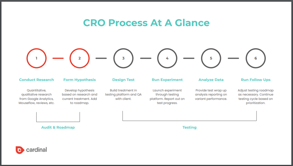
Rich: Yes, this is a heuristic– What we’re going to perform right now is what I call a heuristic walkthrough, a heuristic analysis. It’s just looking and making sure that this site is adhering to best practices from a visual point of view and a structural point of view. If you were going to do a real audit of your site, you would then layer in all these other elements that we talked about, like looking at your analytics, looking at your heatmaps, looking at user recordings, maybe running polls, maybe doing some user testing. I don’t want you guys to think that this is all-encompassing, this audit, this is just one piece of a six-strand research process that we skipped over that you’ll see in this deck when it gets sent out.
Thanks to Evolution Wellness here for letting us pick this apart a little bit. We reviewed their home page, and we reviewed their contact page with the form submission. As I mentioned before, we’re looking at this through a mobile-first lens, so we can jump right in. Again, I think I’ve touched on this, but really, the first thing that you need to do before you do this walkthrough is you’ve got to understand the user. What is the user trying to do? The reason why I bring this slide up is [unintelligible 00:49:05] wellness is behavioral health. We have some behavioral health clients, and we ran a survey because we like to understand our customers and users, so we will run surveys when we have a number of clients in a specific segment.
We ran a behavioral health provider survey, and one thing that came back in the survey was the importance of insurance coverage and affordability. That is the most important thing to the users when they’re looking at behavioral health. The second thing is finding out if a specific service is offered, getting information on hours and locations, and reading reviews. It’s really important to look at the user experience through the lens of what the user is trying to accomplish. If we want to skip over, you’ll see how that ties back.
Hero Section, most important section of your site or your page. It’s where you get all the viewability. Oftentimes, you’ll see viewability drop by 30%, 40%, 50% below the fold, so you’ve really got to get this section right. Some of our observations here when doing a heuristic walkthrough is the banner actually obscures the logo. Again, that confuses the user because they’re like, “Am I on the right site? I can’t see the Evolution Wellness banner. I think I’m in the right place, but I’m not sure.” You’re kind of sowing seeds of doubt automatically there by having that brand name be obscured.
The other thing that the banner does is, from a visual hierarchy point of view, it draws your eye immediately to it. Even though the main thing that this page is trying to get you to do, which is to call or schedule a consultation, the banner is detracting away from that, and is actually overlapping on those two buttons below making it harder for the user to click on mobile. It’s drawing me away from the most important thing that I want my end-user to complete here.
Another thing, again, we talked about this with imagery, and also with providing clarity, is there’s little clarity provided in the hero, so there’s– I know that I’m going to do– Small changes will get me big results, but I’m not sure how, I’m not sure what those things entail. There’s just very little clarity here. Again, if you think about 20% to 30% of my traffic may never see anything but this, you really want to provide some level of clarity in this window of exactly how Evolution Wellness is going to help me see big changes or get big results with small changes.
Another thing, you’ve got the repetition of the main CTA, and that again is obscured by this Wilmington, NC banner here. Again, from an ability point of view, it just makes it a little bit more difficult for me as a user to take action. The main CTA is very transactional, and this is the homepage. This is going to be the main entry point for first-time users, and it’s asking me to do something very transactional very early, and that might not be the right experience. We know, again, we need to motivate our users before we can ask them for something. Got to think about, is it the right time to ask them to call and schedule an appointment, or do we want them to just learn more as the main CTA in that hero section?
Another thing that happened when I was on the hero section here is I got this pop-up, and it was almost immediate. Again, if I’m trying to book an appointment, or if I’m trying to find out more about Evolution Wellness, what this pop-up is doing, even though it might be useful content for me, is it’s distracting me away from my main purpose because it’s unlikely that I was looking for a free anxiety e-course. The other thing that is a challenge for me so early on is there’s no explainer on what else my email address will be used for. If I have privacy concerns, there’s nothing in there that really explains what’s going to happen to my personal information once I submit it to Evolution Wellness. Again, that’s going to cause me to take pause, and again, it distracts me away from what I’m ultimately trying to do.
Lauren: Rich, you may have this in your outcomes, but some better uses for pop-ups when people click to exit the site as kind of a last attempt to engage with them, or a time delay perhaps to give them the ability to first understand the business, so maybe it’s 5 or 10 seconds into the experience that you then provide that information.
Rich: Yes, absolutely. I think exit-intent popups are the ones that make the most sense, especially– But again, I would encourage you guys to test that experience. Certainly, test the pop-up. I wouldn’t just go for it without actually running a test to see if they work effectively or not, because some people do find it very distracting. Another thing too is, content needs to be scannable. Subheaders are really, really important, especially on mobile because, essentially, what a user is trying to do is they’re trying to look at a section as they’re scrolling and say, “Okay, I know what this section is about. Yes, I’m interested in reading more about this,” or “No, I don’t.”
If you have any level of ambiguity around in your subheader, people are typically going to skip that content, even though there could be really valuable content in there. Something like, “Welcome to Evolution Wellness of Wilmington, NC,” that subheader isn’t conveying any value to the end-user. I mean, it’s nice to welcome people, but it’s not giving them what they’re here for. A better subheader would be something like– I don’t know, “95% of our services are covered by most major insurance companies.” You’re immediately ticking off that affordability and insurance piece that they really care about, and they know that that’s important content to them in that section, so then they’re going to read that section and they’re going to engage with that content.
Lauren: Rich, I noticed in your survey, I think– I was scanning it just as you were showing it, and of course, everybody will get this to look at it. I think right below insurance, next most important was the breadth of services provided, right? Kind of thinking about the various motivators that you could put here, you could put something like, “Check out the breadth of services that we have.” Obviously, something maybe a little bit more eloquent. Then maybe instead of, “Get in touch,” which they’ve already had four options to do that, it’s, “Read more about the services that we can provide.”
Rich: Yes, precisely. Again, I mentioned this too on the previous slide, but content, especially on mobile, really needs to be scannable. Again, I think this is a result of taking a desktop experience and condensing it to mobile, is that all of a sudden, you see that the text that did not look overwhelming on a desktop experience, now all of a sudden takes up full screens on mobile. It’s not scannable, it’s difficult to disseminate. Again, we’re going right back to the start of this presentation where we’re making users use that second mode of thinking, that analytical mode of thinking that they don’t like to do. We want to make it as easy as possible, we want to increase ability, so we should avoid using more than two sentences in a paragraph or more than two paragraphs in conjunction.
You want to break this text up with iconography, with imagery. You want to be very succinct and concise, to think about the shortest possible way that you can say something. Then, I think the other thing that, Lauren, you just touched on, is really thinking about that content hierarchy. Here on their homepage, if we know that affordability and insurance is the most important thing, if we know that testimonials and reputation are incredibly important, and if we know that services and the breadth of care is very important, then those should be in prime place in terms of the user experience.
On this website, there’s 12 screen scrolls on my iPhone XS Max, which is obviously a long, large screen to get down to testimonials, 14 to get down to insurance. Again, even when I got to insurance, it didn’t really give me much information except– I know that if I have one of these four providers, that I’m covered, but what if I have another provider? I don’t know. We need to make sure that we’re giving clarity on those things that the user really cares about. The services section was six-screen scrolls down, so again, we’re making it a little more difficult than perhaps we need to, to help our users find the right information.
Another thing I’ll talk about too when you think about a mobile screen window, especially on these long-form pages, there could be 20 or 30 scrolls. If you only have your call button at the very top, or in your hero, or typed right beneath your top nav, you’re potentially asking your user to scroll up 20 scrolls to try and get back to that button to then click it to take the action that you want them to take. What we encourage is for the action to be the sticky element.
If I want to use it to call, then make that the sticky element that sticks to either the top or the bottom of the screen. I don’t think there’s really any empirical evidence that says one is better than the other, you just want it to be as– You want it to be the least distracting that it can be, but you want to make it very easy again, increasing that ability of the users to do the thing that you want them to do.
Then we looked at the form, and I think some little things here, obviously– No need to repeat the logo. They’re already on the site, so they should know what brand it is. One thing that they do really well on the form is they use an expectation manager here. They explain what’s going to happen once someone submits that form, and that really helps reduce and remove a hurdle that the user might have. Again, this is one of these things that when you talk about, it seems really simple to do. You should tell your user what is going to happen to their information, or what’s going to happen once they submit their information before they submit their information.
What companies have done in the past is they tell their user that information, but on thank you pages, or in a thank you message that pops up after the form submission has happened. By then, it’s too late. The user doesn’t care at that point, they’ve already submitted their information. You want to explain to the user upfront what you’re going to do with their information, what the process looks like, who’s going to contact them, et cetera. One thing though that they do have this issue with on the form is that there are what I would call some superfluous fields here, which is– You can’t see it on the screenshot, but I know if you email, the next question is, would you like to be added to our newsletter? If I’m trying to schedule an appointment, I’m probably not thinking about being added to a newsletter. That’s something that I can talk to somebody about later, or if I want to come back to the site and subscribe to the newsletter, I can do so. Again, it’s a distraction in the moment. We want them to become a client, we want them to schedule an appointment, so let’s keep it as concise as possible.
Then, this form is being used for two different distinct audiences, patients and referrals. I would recommend that we split those out because there are different questions that are required for each. Again, you want to make that user experience as simple as possible for your defined audience, so an easy thing to do would be to break those into two separate forms.
Lauren: Rich, we talked a little bit about the pop-up. I’m going to get to really our final statement here, which is all of these– Everything we’ve spoken about, the heuristic analysis, the quantitative and qualitative research, the surveys that need to happen to really even begin to build a CRO roadmap turns into something like this, right? A roadmap whereby we have very clear hypotheses, we have what we think– We use the ICE method, highest impact, lowest effort to prioritize them. Then you really get in, this is where the retainer is important because this testing never ends once we start developing these ideas.
I want to give you the opportunity, Rich, to have a closing thought. I know we may have lost a few people as we dip into three o’clock and people have conflicts, but anything you want to add to just wrap this conversation up, Rich?
Rich: Yes. I think your user experience is an incredibly important element of your overarching marketing strategy. Once you have a strong user experience, there are going to be certain elements that you’re just unsure of. There are best practices, but then there are things that need to be tested. That’s where the benefit of having a CRO program comes in. Not every test that you run is going to be a winner. The average is one in five tests are a winner, but the better the researches that you do, the higher propensity you’ll have to derive winning tests.
If you can be good at doing your research, and really figuring out what makes your users tick, and identifying weak points, then you should be effective at creating tests that are going to improve your user experience, and 30 to 40% of tests should be winners. The yield of those tests could be huge. I mentioned the Lifestance test that increased their conversion rate by 30%, and that allowed them to cut back on media spend by a substantial amount, which they could then reinvest into other marketing activities. It can easily pay for itself over and over again if you guys are willing to invest in this process and in this service.
Lauren: Awesome. Well, this is going to go out– I know we didn’t get a chance– You spoke about this Lifestance test already, Rich, and we fielded some really great questions throughout the conversation, so we really appreciate it. If you have additional questions that we didn’t get to today, if something pops into your head that you think about afterwards, or maybe you decide to go take a look at your mobile experience and you see some of the issues that Rich just pointed out on the Evolution site, please don’t hesitate to reach out to us. We would love to go through this in a one-to-one capacity with you. Thank you all so much. We’ll talk to you next time. Thanks, Rich.
Rich: Thank you.
[01:03:51] [END OF AUDIO]